ipushpull
Design system & branding to create a holistic brand which is distinctive within the sector
A financial technology software-as-a-service platform that securely connects data from the desktop to third party applications, mainly used by medium to large financial services companies.
The Proposal
Challenge
How do we create a trustworthy brand to stand out in a marketplace where trust and security are of the utmost importance?
Current market insight
Before the redesign of the brand, the standard colour used to signal trust and security in the market was blue, however security is not based on colour but the company offering. Leaving a gap in the market for a brighter brand to stand out.
The Solution
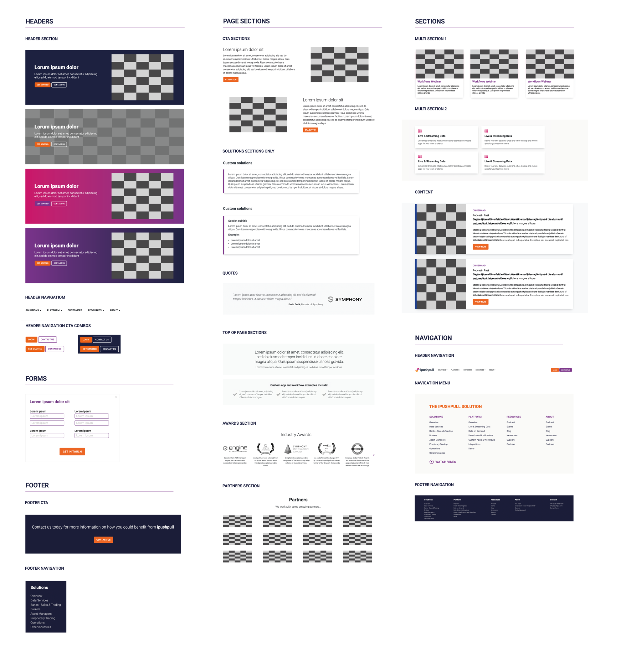
From research we found out which colours users were drawn to the most and created a bright combination which was then tested. I then created a brand book which dictated how the look was used across the board, building on it to create a design system for the digital platforms and mobile. Creating a holistic brand across the board made ipushpull immediately recognisable.
Firstly I created two proposals for both secondary and primary research, to be conducted before and after ideation and design. My previous experience of marketing allowed me to create a market research analysis, which showed that that trust and security was a leading factor in the choice of tech platforms for customers. An in-depth competitor analysis, confirmed our hypothesis that the “safe” colour blue was used in 95% of brands at the time of research.
The Role
Product & Brand Design
Tools
Miro, SPSS, Illustrator, Photoshop & After Effects
Secondary research
Please find the full competitor analysis here and the full market analysis here.
Key finding:
There was a gap in the market not only for the product itself, but also for a trailblazing brand. All the other brands didn’t look like they took any risks, although some brands started switching their branding to dark mode by the end of the study, it was also based around safe colours and branding.
Research
We began with market research, competitor analysis and attitudinal studies.
I analyzed the strengths, failures, opportunities and threats of the current market.
Attitudinal study
I conducted attitudinal studies with participants from the finance sector between the ages of 35 and 65, presenting them with score cards for multiple color choices and color combinations to assess their overall opinions (cognitive) and impressions (affect). The test was sent out to 20 participants in total, who filled in the forms online. Participants were also allowed to leave comments at the end of the study.
To ensure a comprehensive understanding, the study included a mix of single-color assessments and more complex combinations to gauge the emotional and psychological impact of different hues. The collected data was analysed to identify trends in colour preferences, with particular attention paid to how these preferences might influence user interaction and trust. The comments provided qualitative insights, offering deeper context to the quantitative scores.
Synthesis
Once the results were in, I used SPSS to analyse the trends of the colour preferences of all the participants and organized the findings. I created a plot graph to illustrate the results of each study to compare the trustworthy and not trustworthy colours with the colours that were deemed bold or dull, in order to create brand colours that would be trusted but would catch the interest of the users as well.
“I think we need more colour in the industry, it’s all quite bland at the moment.”
“Colour isn’t something I think about much but it does help me navigate around websites.”
“The best websites that I’ve seen aren’t overly bright, they use colour more to accentuate, not have blocks of colour.”
Key finding: One of the things that I was not expecting to find in this study, was how forgiving the participants were of the colours used. When speaking to the participants after the study, I learned that there was a difference in what they felt the colours signified, however it would not have as large an effect on their final decision of whether to trust a brand. It did work towards catching their attention more in their experience.
However, when testing the significant difference of the study, I did find the study to be significant. Therefore it was safe to use the colour palette chosen by the participants and their combined responses were unlikely to be due to chance.
Branding
Brand exploration
Logo
Logo exploration
BRAND VIDEO FOR INTROS - CLICK TO PLAY
Brand Book
I created a brand book to ensure consistency in visual identity, tone of voice, and messaging across all platforms, providing clear guidelines for logo usage, color schemes, typography, and imagery to maintain a cohesive brand experience. This brand book also serves as a reference for both internal teams and external partners, helping them align their work with the brand's core values and aesthetic standards.
Design System
After a lot of consideration and research into the best colour palette for the brand, four colours were picked and a new logo was designed. However, after putting together all the colours and checking them against the WCAG 2.2 accessibility standards, we found that a 5th colour was needed which was darker in order to make the palette more sight accessible if the yellow colour was used. When using the yellow, in combination with white the contrast was too low.
Branded Documents
Case Studies
Exhibition Leaflet
Webinar LinkedIn cards
Other Work
IPUSHPULL WEB & MOBILE DESIGN
IPUSHPULL WEB APP
FUND FAST WEB & MOBILE DESIGN


